Pro Log 01.
In my undergraduate program at Northern Michigan University, I was assigned a semester long sketchbook project by my illustration professor. It was to be dedicated to one topic or method of my choice. In the limited stack of books I could take with me each semester, I had brought my copy of Color and Light by James Gurney. The parameters I set were as such: I would paint strictly from life – no photos or invention. Each sketch would be focused on interpreting light, shadow, and color. Form and line were not the main concern, and would emerge as a byproduct of focusing on light.
Painting from life was, and to this day is, the easiest way for me to get a “good” result. It also feels the most rewarding. I can pretty instantly get into the flow state with a subject right in front of me and a distraction-less block of time. I initially planned for the assignment to be entirely digital, but for a few nights I broke out the watercolors.
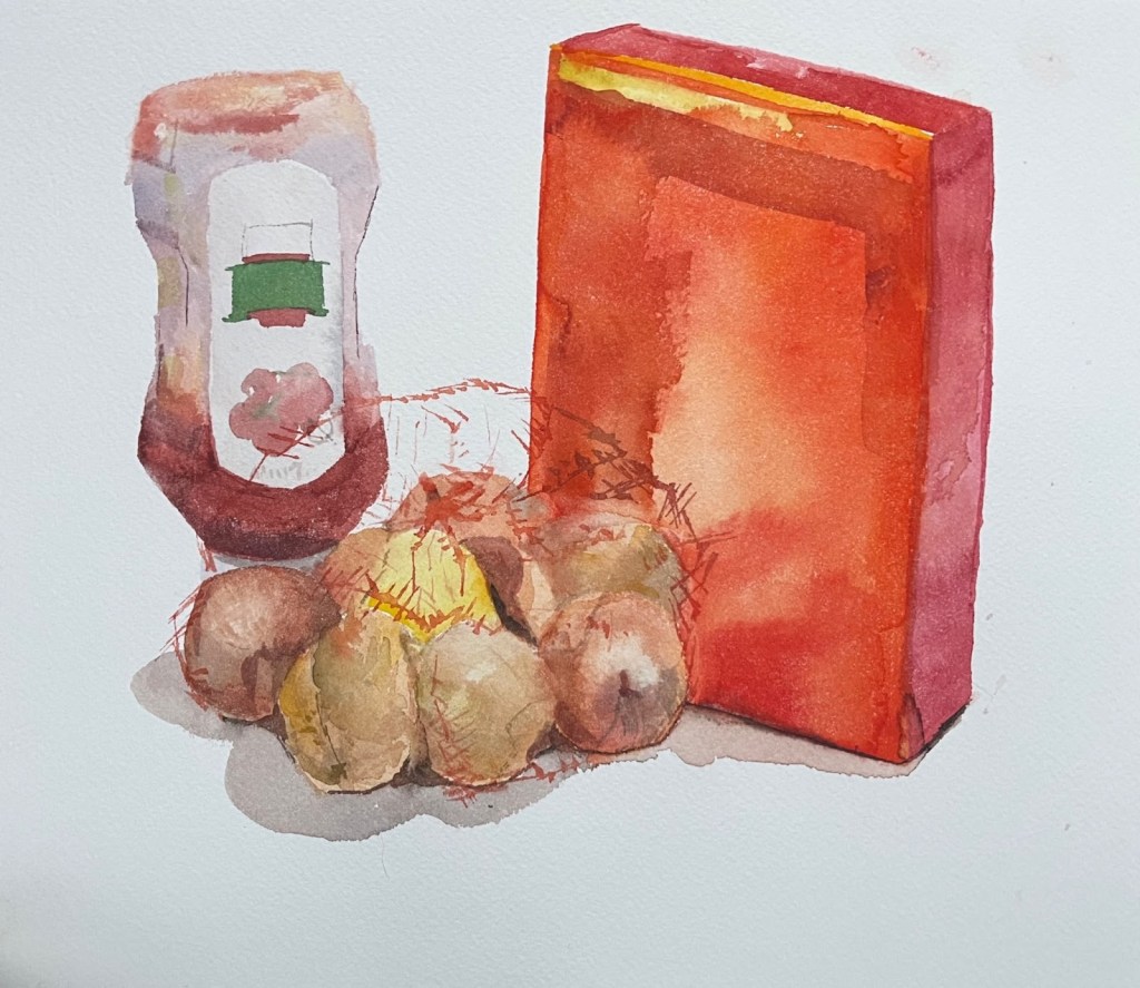
My roommates named me minimalist, and by comparison they participated in much more sane, lived-in habits (messy). They left a box of cheezits, our communal onion bag, and a third of a bottle of ketchup on the kitchen table where I needed to set up my paints. What would normally annoy me during cooking and cleaning kept me happily occupied during study, and served as my subject for that night’s homework.
If memory serves, the entire painting was done with a half inch Richeson synthetic brush I’d received for free upon registering for a painting competition. It’s a wonderful brush. Besides that, Cotman synthetic brushes are my absolute favorite for watercolor and gouache. Flat brushes that have longer bristles hold a lot more water at once, and the flat edge allows me to quickly block in shapes, create hard straight edges, and scrub in softer round shapes when needed. It’s much harder to get both shape types with a round brush. The watercolor kit I use is Mijello mission gold colors. They have great pigmentation, and come with a cool and warm version of each color without including excessive variations. In addition to watercolors, I always keep white gouache on my palette in case I want to introduce opacity.
I love the transparency achieved here in the ketchup bottle, the net surrounding the onions, and the onion layers themselves. The central idea when representing transparency, or light in general, is to interpret light or dark, and cool or warm. Lowering the saturation of a warm color means bringing it closer to grey, which means cooling it down. So saturation has a hand to play here- in that it affects coolness. But the main axes I’m considering is light or dark, cool or warm.
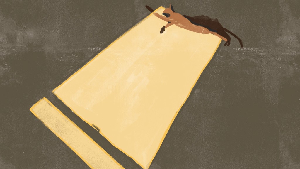
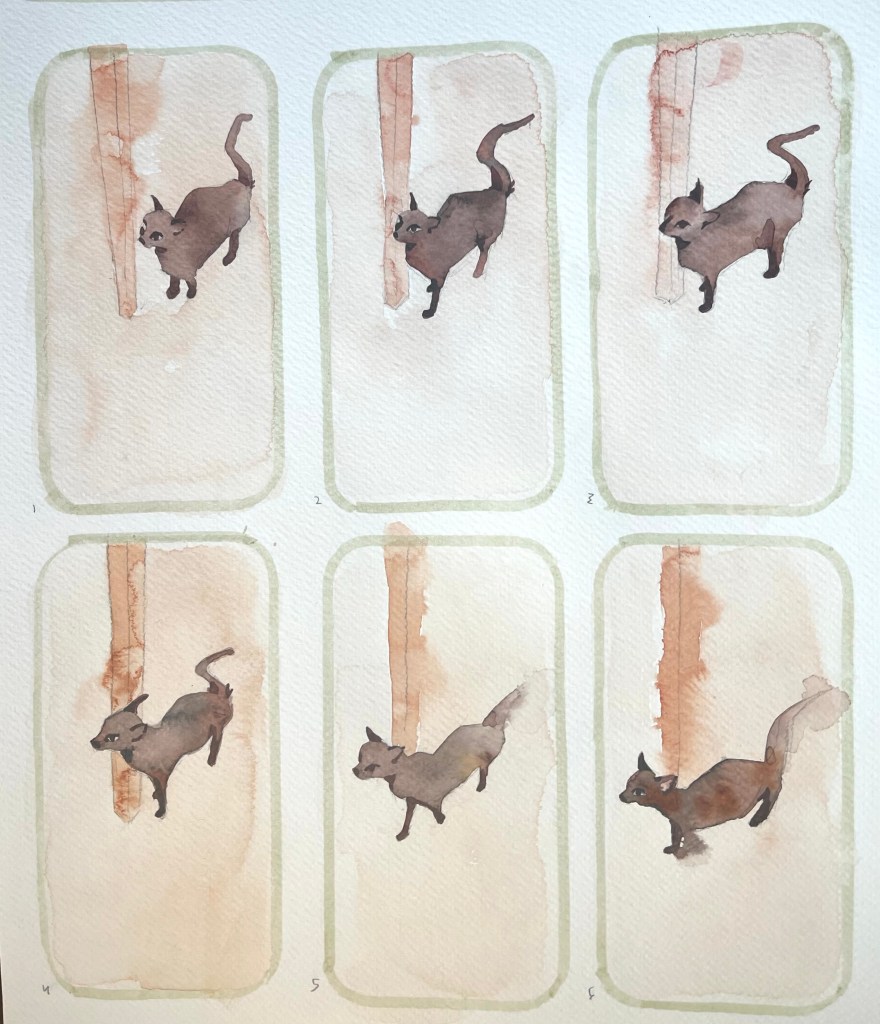
I came out of the womb an animator, so the next study was a six frame animation of my favorite roommate, Chai.
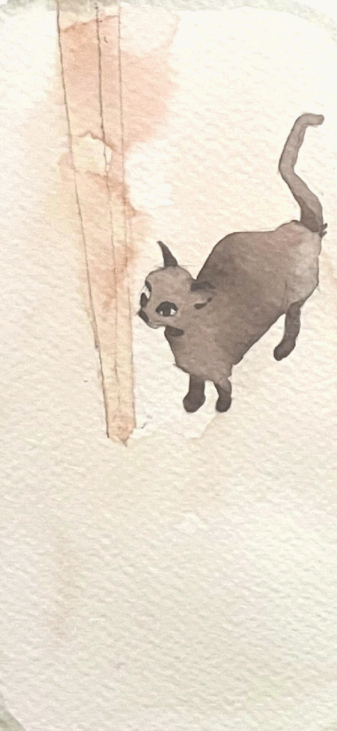
I used a single large piece of cheap watercolor paper, and traced around my phone case to create the boundaries of each frame. That way the sizing would be relatively consistent, and I could take photos of each frame and compile them digitally. All six frames were painted side by side without a light table. Mass and perspective of the table leg shifted quite a bit, but miss Chai Chai moves pretty solidly throughout. I paid special attention to shape of her haunches and the hump of her back as she stretches.
For each piece, I included a page number and a time of day, although I wish I had dated them. Each of them was painted sometime in the fall of 2024. This piece was created at 8pm. The translucent dried orange slices hung in the window and struck me with their intense saturation. They were backlit by the sunset, and so the living room window became my motif.
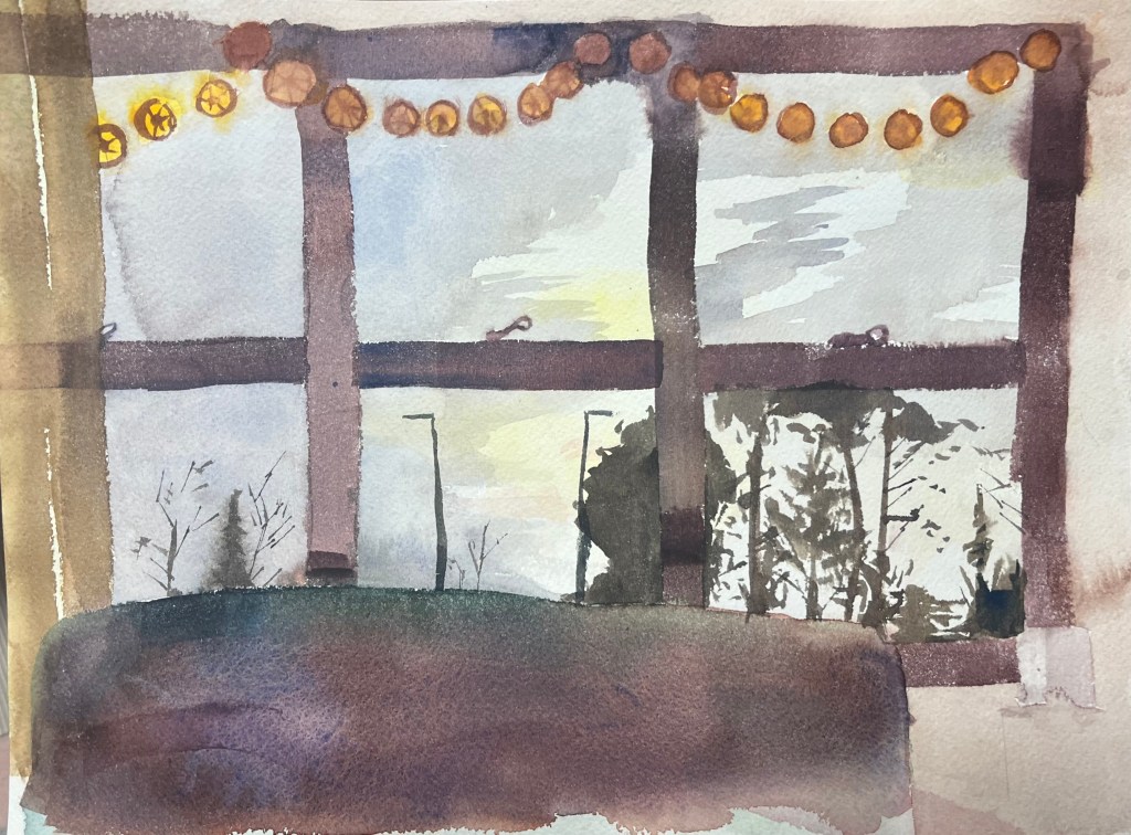
At the time, I was disappointed by this study. I suppose it’s a sign that my skills are improving, when many pieces disappoint me while the toil is fresh, but impress me upon later viewing. I applied the darker orange to indicate the layers of pith and the rind too soon after applying the more saturated lighter tone of the translucent flesh. The watercolors ran together and became muddy.
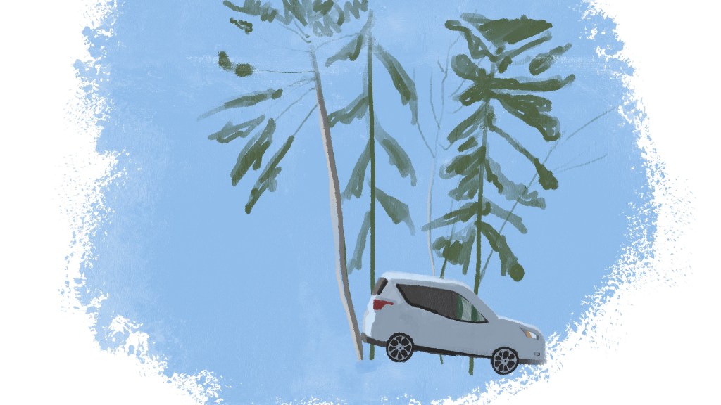
I especially appreciate the delicate marks of the leaf-bare tree branches and piney conifers. I also appreciate the compositional choice to place the vertical blinds askew and at the edge of the frame. It caps off the piece where there would otherwise be white walls creating an endless feeling to the composition.
Lastly, we have the remains of one of our many gatherings. We loved to host, and this was the disaster aftermath of Rhiannyn’s birthday party. There was so much liquid housed in plastic and glass, butted up against and overlapping each other. It was a technical challenge and an appreciation for the radioactive colors of the leftover beverages. I had to make sure to leave plenty of white space for the air behind the bottles to show through. I also had to be intentional with my wet-on-dry and wet-on-wet usage.
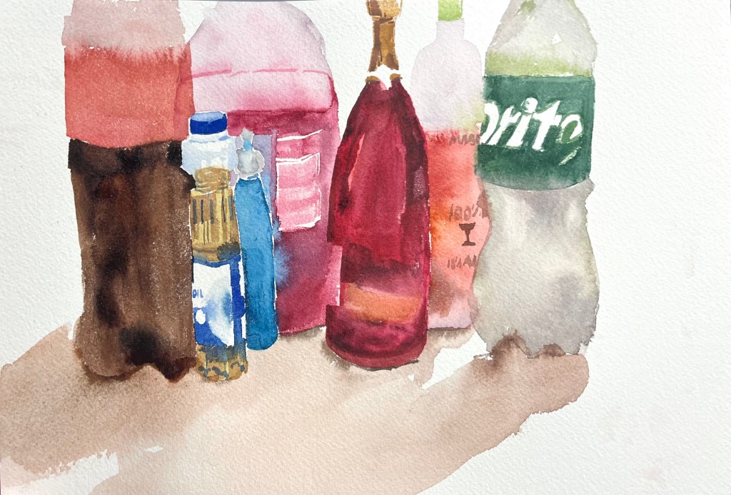
Watercolor is a transparent medium, and so by nature lends itself to transparent subjects and reflective light. Different watercolor pigments have different levels of granulation, which can add a sense of movement to each wash, helping simulate reflected light and complex shadows. The way the pigment moves within water records its path in time. If you envision holding a piece of paper at an angle and painting a stripe at the top of the page, the color will run down in unpredictable paths. This means a lot of movement will be happening, at no extra cost to you. This also means some strokes are not undoable.
To get things bouncing around in the right way, I started with the foremost bottles and moved backward. That way I wouldn’t end up painting too much of the pink Hawaiian Punch and have it show strongly through the oil and blue Koolaid.

Here is the entire sketchbook in chronological order, including the digital pages done in ProCreate on my sister’s old rose gold iPad. Each session worked on this sketchbook was a precious kernel of time well spent. I laid down careful, considered marks, yet maintained the “loose” energy of exploration. There were very few distractions, no background noise or music, and each session was limited by the constraints of my schedule. This fostered urgency that kept my mind focused.

Leave a comment